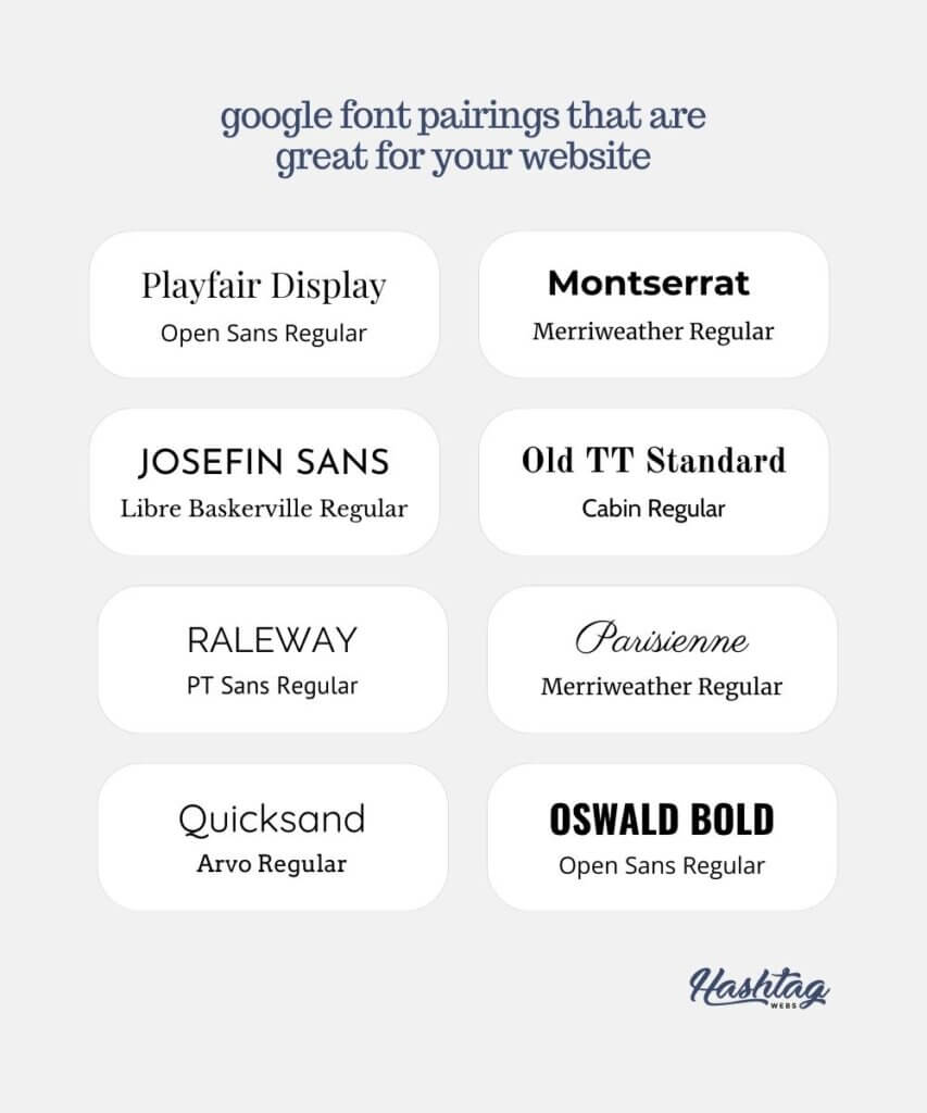
Choosing website design fonts is a big thing. There are several mistakes to avoid.
I really could go on forever about this, however there are a few key areas that come up frequently:
✖️ Too much letter spacing, especially in cursive script fonts
✔️ With a cursive font, try and get it to read like handwriting. Minimise that gap!
✖️ Using the wrong font for your business (e.g. aggressive looking when it should be calm)
✔️ Research don’t pairings on Pinterest and find something that matches your brand
✖️ Background contrast. It should be easy to read the words
✔️ Always bear in mind your readerships age, and of course, people with dyslexia and other disabilities.
✖️Too many fonts! People love to select 5 or 6 fonts but it clutters the site and makes it appear messy
✔️ Stick to 3 or 4 max: Heading, Sub Heading, Body/Paragraph, Logo font
It’s easy to get carried away when you’re designing your site, but trust me, stick to these 4 simple rules, and it will look slick.
Here are some Google website design font pairings we think are gorgeous

Want to know what we use?
For our headings we use Trocchi
Headings
For our subheadings we use Trocchi
Subheadings
For our body text we use Montserratt
Body text
Written by Jade Tremarco
Owner – Hashtag Webs

